Adelle Jewellery
UI/UX Design / Year: 2021 (4 months)
Overview
Adelle is a pioneer of world-class jewelry art in Indonesia. Not just selling diamonds, their mission is to create conceptual masterpieces that deliver messages and emotional value that connect people.
During the pandemic, in-store jewelry shopping has become a constant challenge. Adelle had already launched their own e-commerce site, but the traffic and conversion rate is low. Meanwhile, they learned that their online marketplace purchase is growing. They saw this as an opportunity and trust us to revamp their site.
Team
UI/UX LEADFanny Tania
UI/UX DESIGNERErickson Jowana
CREATIVE DIRECTORFanny Tania
VISUAL DESIGNERTeresa Anne
The
Proces
We approached this project with design thinking method. We spoke to internal stakeholders to understand their business goals, current problems and gain deeper insight of the jewelry industry.
We then defined the goals of the website redesign as follow:
- To enhance the overall online shopping experience
- To enable easier product browsing and discovery process for both offline & online customer
- To help Adelle jewelry products move beyond being a commodity, but to highlight their well-thought-of product concepts and strong brand values
Discovery
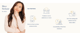
We did desk research and user interview, where we talked to 7 person who fell into the criteria of Adelle’s target customers. Some insights from our interviews are:
Some problems discovered from our interviews and research are:
- Users have worries while shopping for jewelry online, from not getting the right product (size, diamond cuts, personalized engraving) to product handling/packing and safe delivery
- Diamonds itself have high complexity, from their cuts to their authentication and certification. For some users, they will need to be assisted in their shopping journey by diamond expert
- Adelle has extensive products and collections which is not ‘ready stock’ and some products have very high similarity that it’s hard to tell their difference when you’re only looking at the image
How Might We
We cluster the problems and brainstorm for possible design solutions.
- Give plenty of assurances along the way.
Encourage users to shop online by providing detail product knowledge, enable virtual consultation and flexible check out options (delivery/pick up). - Make sure they feel a natural flow to move forward.
A homepage that could accommodate these 3 persona, user who come to explore new collections, those who come to search for specific products, and come to dream their future jewelry. - Keep things as simple as possible.
Present clear product classification and enable comprehensive product filters.
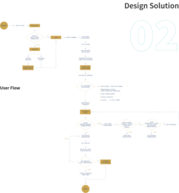
Wireframe
Website
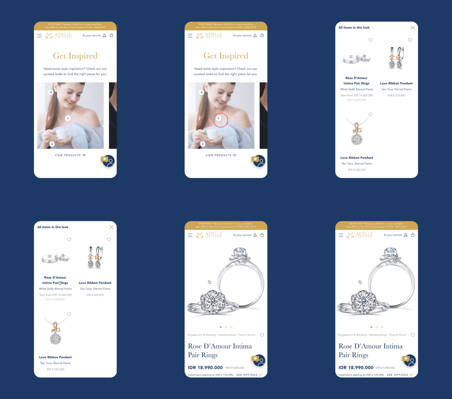
Digital Lookbook
This section was made simillar to social media feed that most people are familliar with. Product tags make it easier for people to discover and engage with the products. It’s also highly responsive across devices.
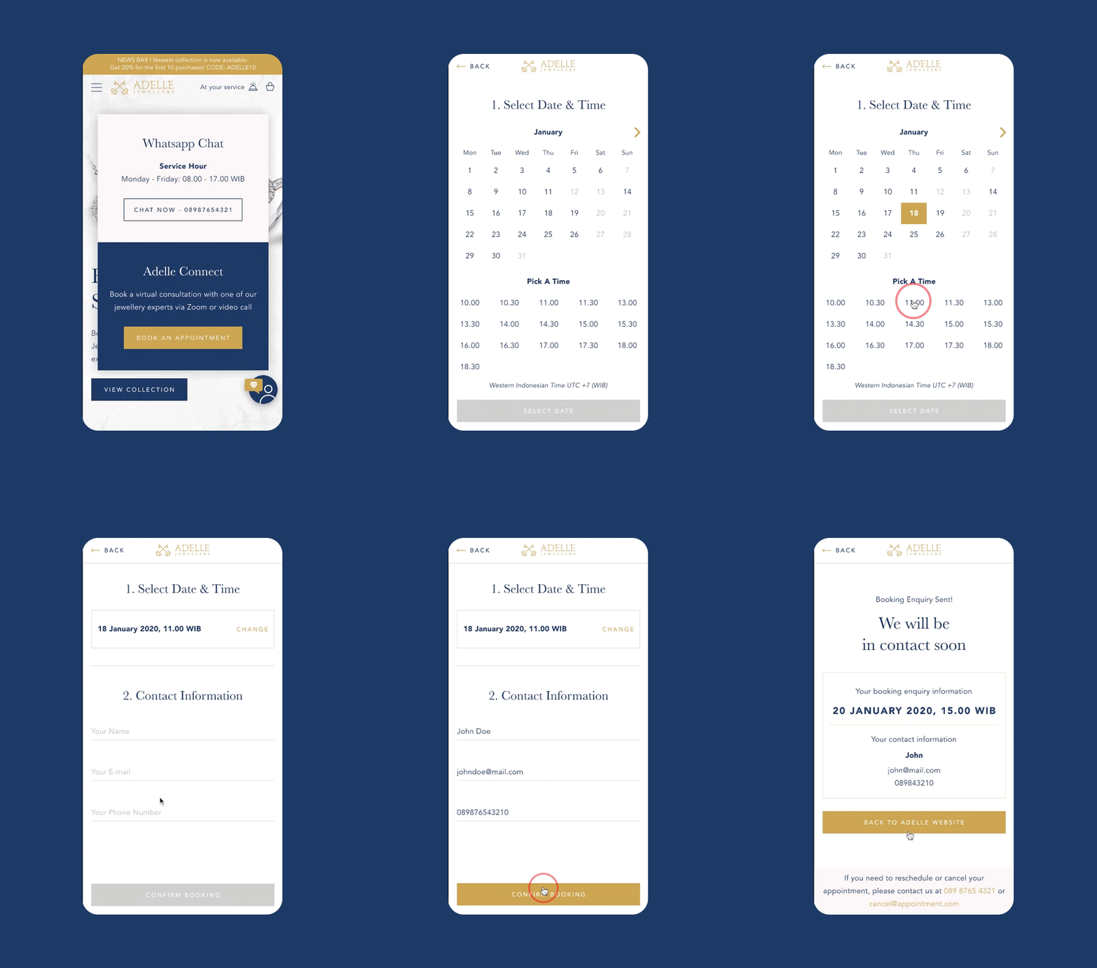
Adelle Connect
Due to pandemic, Adelle needs to provide free online virtual consultation service. This helps user to get expert advice and close-up store like experience from home. We help them by creating a book apointment form.
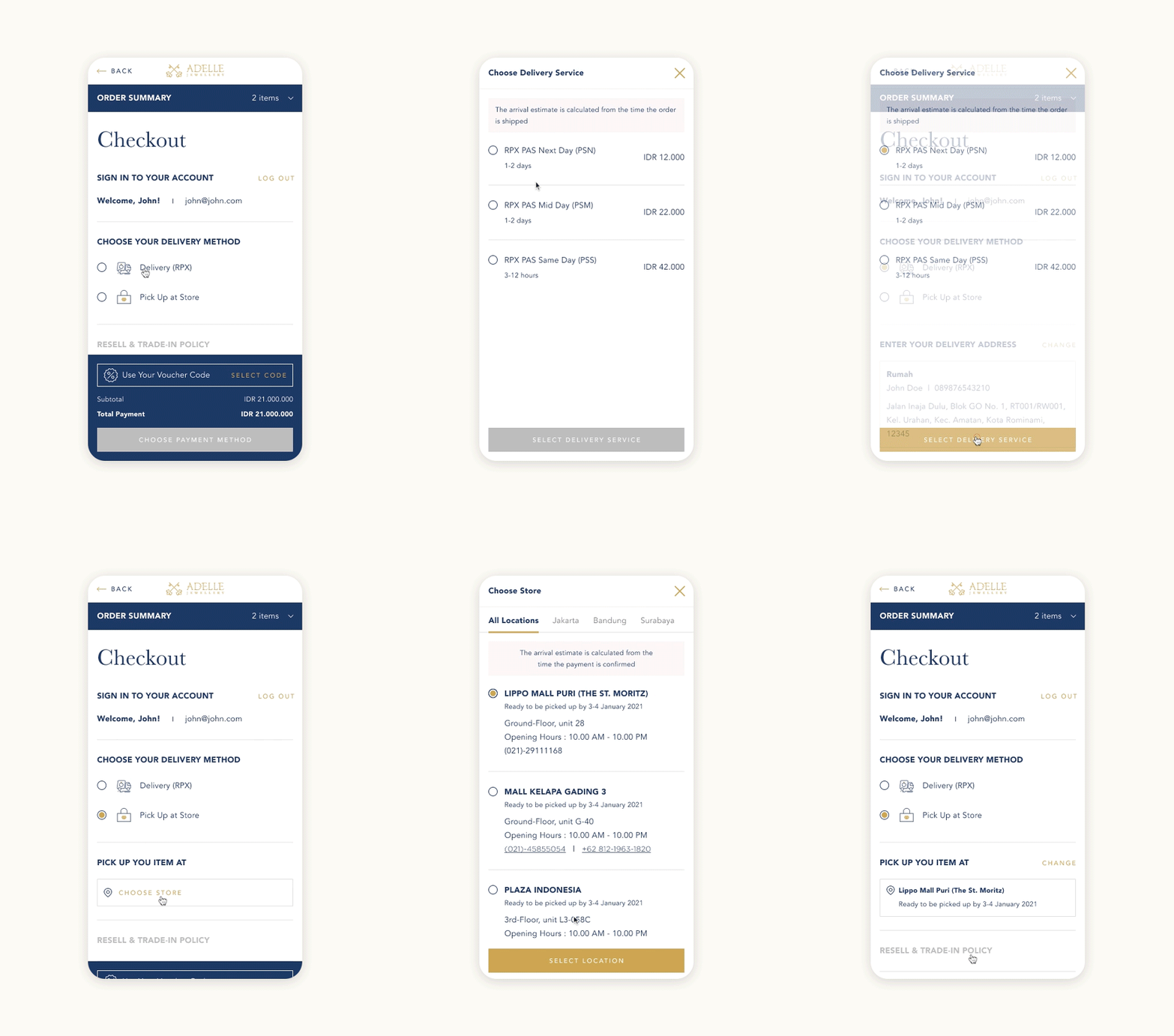
Flexible check out options (delivery/pick up)
Clear product classification and comprehensive product filters

